Here we have artinprint.org, a site dedicated to covering the world of printmaking, designed and built by myself and Chris Palmatier.
There is currently a lack of serious writing about prints and printmaking, which is somewhat ironic. As editor-in-chief Susan Tallman points out in her introductory essay, “Take a walk through the contemporary wing of your local museum and count the number of works that do not employ print media, imitate print media, or allude to print media. You probably won’t need both hands.” From industrial processes to classical techniques, printmaking defines much of contemporary art. The medium may not be the entirety of the message, but it’s a damn big part.
Printmaking is obviously very close to my heart, and I jumped at the chance to build this site. I studied printmaking in school, and it shaped how I work to this day. When I’m working on a project, be it a film or a website or a song, the conception and execution are inextricably tied together. The image and the processes that make that image are parts of a whole.
As proud as I am with the design work, it goes without saying that good design is meaningless without good content. This site and journal have that in spades, enough so that they started getting recognition before the site even launched.
Working on this site with Chris was a pleasure, and I will willingly do it again any chance I get. It was important to me that not just the construction but the design process be collaborative for a couple of reasons: 1, Chris suffers from extreme technical competence, and because of that he rarely gets asked to do visual design (which he’s very good at); and 2, because I really like collaboration. I generally work alone, and miss the back-and-forth of working with peers, especially ones that are good at what they do. Our aesthetics are fairly different, and I’d say this site reflects a good balance.
How we got there.
(I’ve been meaning to write some detailed accounts of how the design process works with specific projects, and I think this one is a good place to start. I realize this is a bad idea, professionally speaking, in that what appeals about design is subjective, and by framing projects based on how I approached them I’m depriving potential clients of seeing my brilliance in ways I’d never intended. So it goes.)
I always start by discussing over-arching design and execution issues with clients. Who’s the audience? How complex is the site? How dynamic is the content? How much of it goes where? I also try to get a sense of what they’re looking for in both design and functionality by asking them to send me 5 sites they love and 5 they hate and explain why. This is usually a good way to begin discussing design as more than just decoration.
Art in Print were very prepared. They had a survey of their potential clients, a rough outline of sections and content, and since they were just starting out they had a business plan. I put together a site map and started estimating the number of templates we would need to make.
From there, I built 4 very divergent comps of how the site could be laid out based on initial conversations. More of a Rorschach test than good design, they served the purpose of fleshing out how pages should function. For me it was an experiment to see what would happen if I delivered comps that were more developed instead of just wireframes at the beginning of a project, and I’m still unsure of whether it was a helpful step or not. On the one hand it does help all involved picture actual content in actual layouts, but on the other hand it makes ideas seem more final than they really are.
As part of this experiment I built the comps in Photoshop instead of HTML, and I probably won’t do that again. While I like the fact that Photoshop makes me solve problems differently than code, I don’t think it inspired me to do anything superior to what I would have done with just code.
This was followed by a day of meetings in Chicago to flesh out the structure and concept, during which Chris built a rough model for the home page that we all agreed was great. The current home page isn’t too far from what he delivered there: large images cycling up top, 4 articles cycling below.
From there, Chris and I came back to Oakland and got to work. Since we already had a sitemap and some sense of the components for each page, we wanted to focus on the visual presentation, starting with a logo. Multiple ideas were thrown around, mostly based on classic magazine identities, none of which quite clicked. Eventually, Chris came up with this idea:
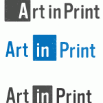
A great font choice (Vinyl OT) and relevant without being too stylistically narrow. I came up with the idea of reversing out one word to connect it to the positive/negative processes of printmaking. I played around with a few variations, and narrowed it down to these:
We both felt like there was a clear winner there, as did the client. We had initially been thinking we would color code the various sections of the website, but kept coming back to a rich red. Using different colors for each section became tedious and didn’t compliment the simplicity of the site. We also ditched the texture. While I liked the use of wood grain and the implication of an inked-up block, detailed texture doesn’t scale well, as illustrated by that thumbnail. Plus, it narrows down the range of print mediums implied to just woodcuts.
With that out of the way, we started focusing on layout. The client wanted a lot of white space. This is every designer’s dream, not to have to worry about cramming content together to “get it above the fold.” Getting things above the fold is obviously important, but using white space is more important, if harder to explain. Clearly delineating components of the page makes it easier for the reader to use what’s there, and users will appreciate the logical structure even if they have to scroll. Plus, lots of white space mirrors the tradition of having generous margins around fine arts prints.
Several different layouts were tried, with variations on list pages and content pages. Sidebars jumped around. All the sort of uninteresting but important mechanical page flow ideas were sorted through, and we ended up with what we have now: a single sidebar to the right, large titles, and blurbs with thumbnails.
It was important that the site not get too tied to a specific era in the graphic design. This site deals with everything print-related, from medieval to contemporary, and leaning too heavily towards an era-specific stylistic frame would favor one kind of content over another. Having significant white space and a condensed, sans serif logo started implying a mid-twentieth century aesthetic – something we all responded positively to, but not as neutral as it should be. That lead us to the idea of using Calluna Italic for all headers. It’s a modern font from ex-libris, but it has a classical feel to it, which helped balance the stylistic range of the pages. I often say that only bad font choices really matter, but this is an example of that not being true. That one little component ties the site together quite nicely.
From there on in, it was all a matter of building templates and testing them with actual content (followed by building the more technically-oriented components, such as a way for members to pay for subscriptions). This site was built on the Expression Engine platform. We needed something a more robust than my go-to CMS (WordPress) and Chris suggested EE. Because he had experience with it and I didn’t, he became the technical lead, leaving me to do the CSS, template coding, and project management.
Expression Engine was very straight forward. There was a learning curve involved, but the principles are still the same, and building templates proved easy enough once I learned the lingo. In my opinion there are some big holes in EE as a CMS, but I’m convinced that it’s only a matter of time before those are overcome. The way they work with their community of users should be the model for software development, and their product has benefitted greatly because of it.
Part of the business model for Art in Print is based on selling a bi-monthly PDF, designed to fill the void of some previous print-oriented publications. Since I don’t do much InDesign work, Chris took on the job of building templates for the magazine and did a stellar job. The package he delivered them will suit them for a long time to come. You can download the first issue in its entirety here for free.
I really enjoy seeing big projects like this through from start to finish, and this one in particular was a real treat.

