Some jobs don’t work out for whatever reason, and this is one of those. However, I like the design, and wanted to post the mock-ups here.
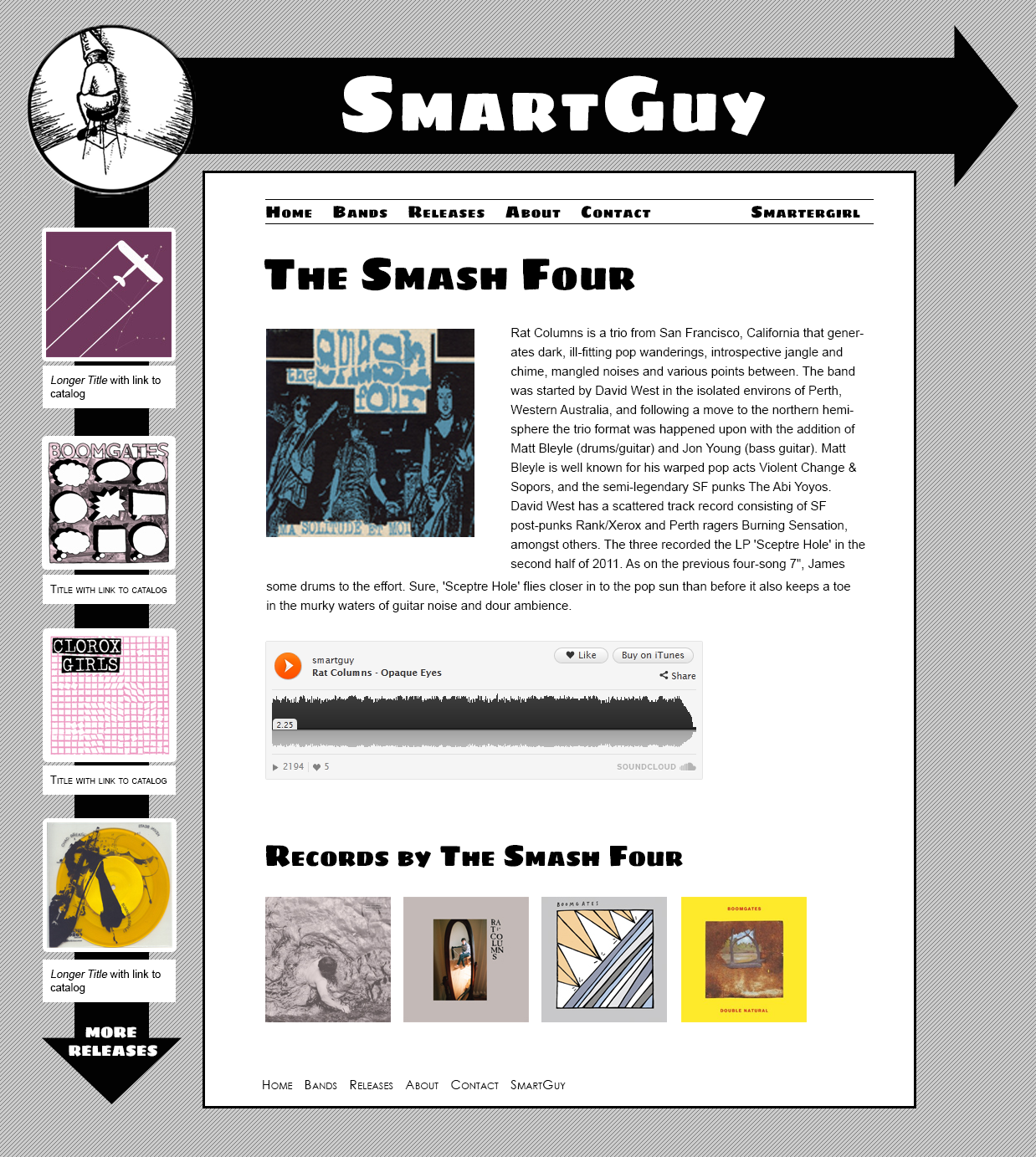
SmartGuy Records has been around for several years, and have consistently been putting out 7″ singles by good bands. Jerry, who runs the label is someone I met back in Chicago. I’ve done some work for him before, including the logo (not my favorite thing that I’ve done, honestly), but it’s been a few years. Recently, his wife started talking about starting a label of her own (Smarter Girl), and wanted to make a site redesign a part of the launch.
The idea was to have 2 sites that paralleled each other: the graphics would be a mirror image, the SmartGuy side would be mostly black and white while Smarter Girl would have more color.
-
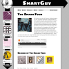
- SmartGuy
-
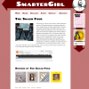
- Smarter Girl
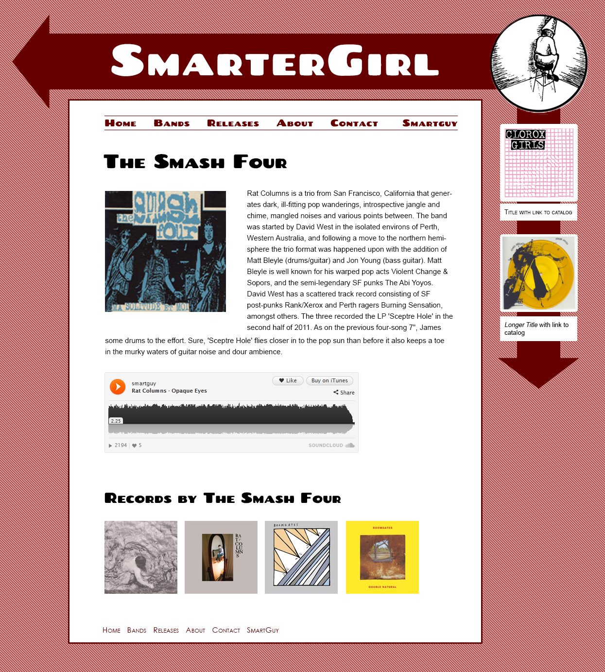
It’s a simple idea, but it worked. The google webfont Chango (which I’ve since started using here) worked nicely with both sides – it’s got style, which works for Smarter Girl, and also gives a Spy vs. Spy vibe to SmartGuy.
Unfortunately the project was scrapped, as happens. I’ve been doing more development than design lately (hence not posting as much here), and at least getting started on design projects like this is always satisfying.