Here we have the cover for the newest Generalissimo Record.
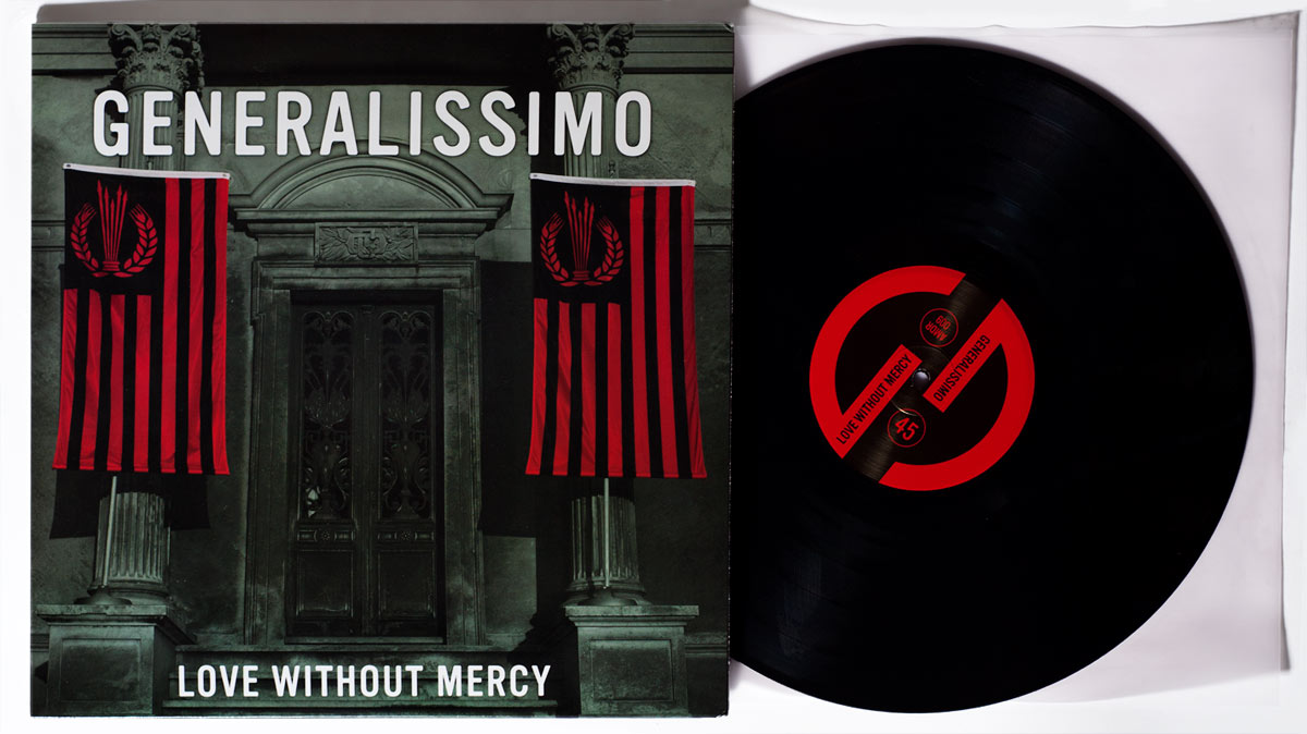
Expanding on the graphic themes of fascism that are this band’s milieu, I wanted to do something that was photographic, but very geometric and architectural. Something imposing, classical, but generic – it could be a bank, it could be a theatrical hall, it could be a palace. Or, it could be a mausoleum. Andre wanted to keep things simple, with a duotone style, which suits the graphic lingo of fascism and is fun to work with. He wanted to show off the new flags which he designed as well.
As a designer, I can’t help but love the big 12″ wrapper that records come in, and the potential that has for striking imagery. In all of this, though, I’m very proud of the small detail in the concrete over the door, which I modified so that it says G-M-O, or G’Mo, which is the way the band name often gets shortened in emails etc. A pet name.
Note that the center label doesn’t have an A or B side, again fitting with the utilitarian quality of a lot of this design (which was a guiding principle in both the CD and 7″ packaging).
The back cover is a very dark, subtle photo of the flag, flattened out into the green tinted photo. Your monitor won’t do it justice, so if you want to see it you should buy a copy.